
.svg)

Panacea started as a soulful, chakra-themed mushroom chocolate line in Los Angeles — high-quality, deeply intentional, but visually inconsistent and too homemade for the premium wellness market. The founder, Drea, needed a full rebrand to bring clarity, coherence, and elegance to her growing line of functional mushroom products.
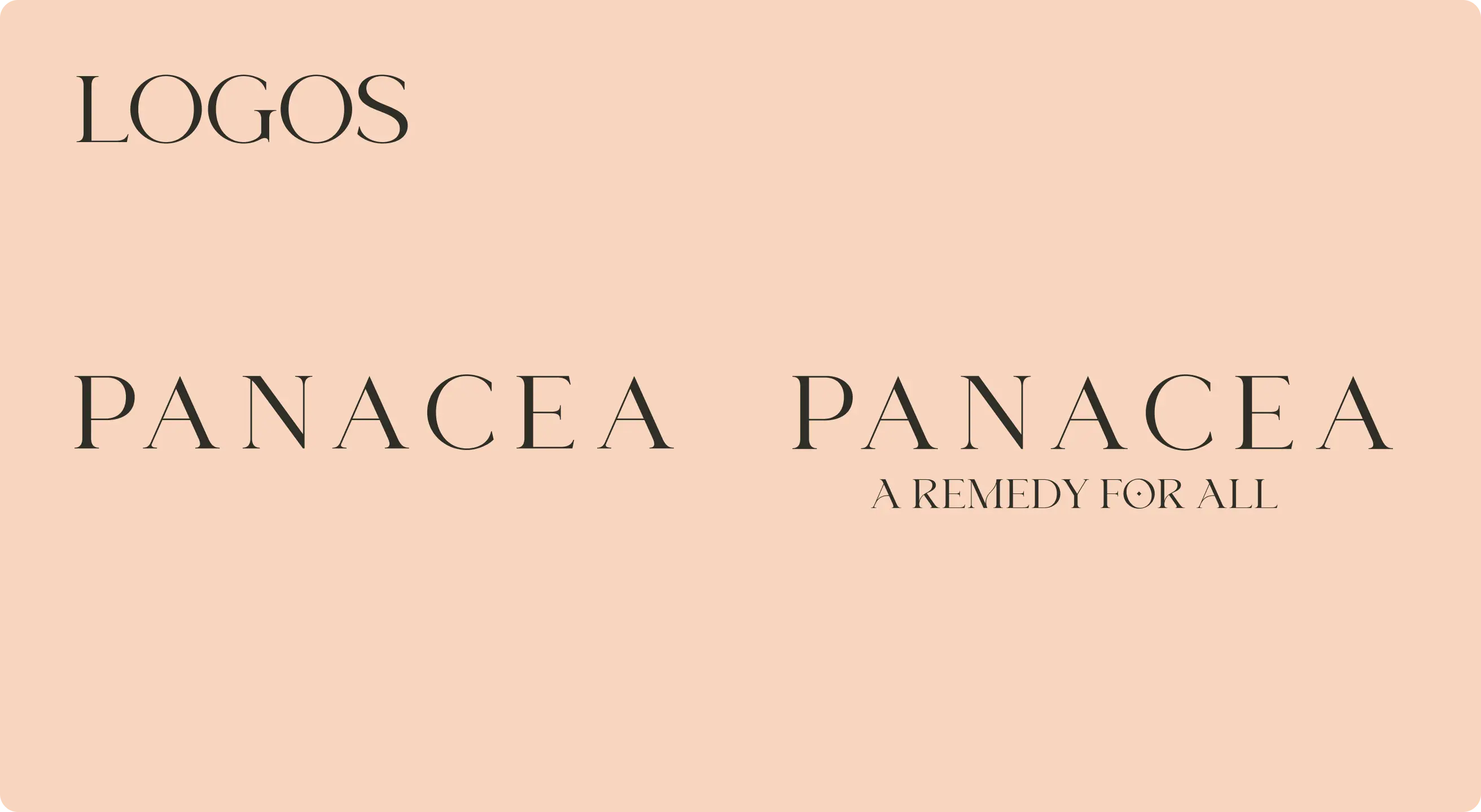
The goal was to elevate the brand into a refined, modern wellness identity while preserving its spiritual and artisan roots — appealing to a broader audience without diluting its authenticity.
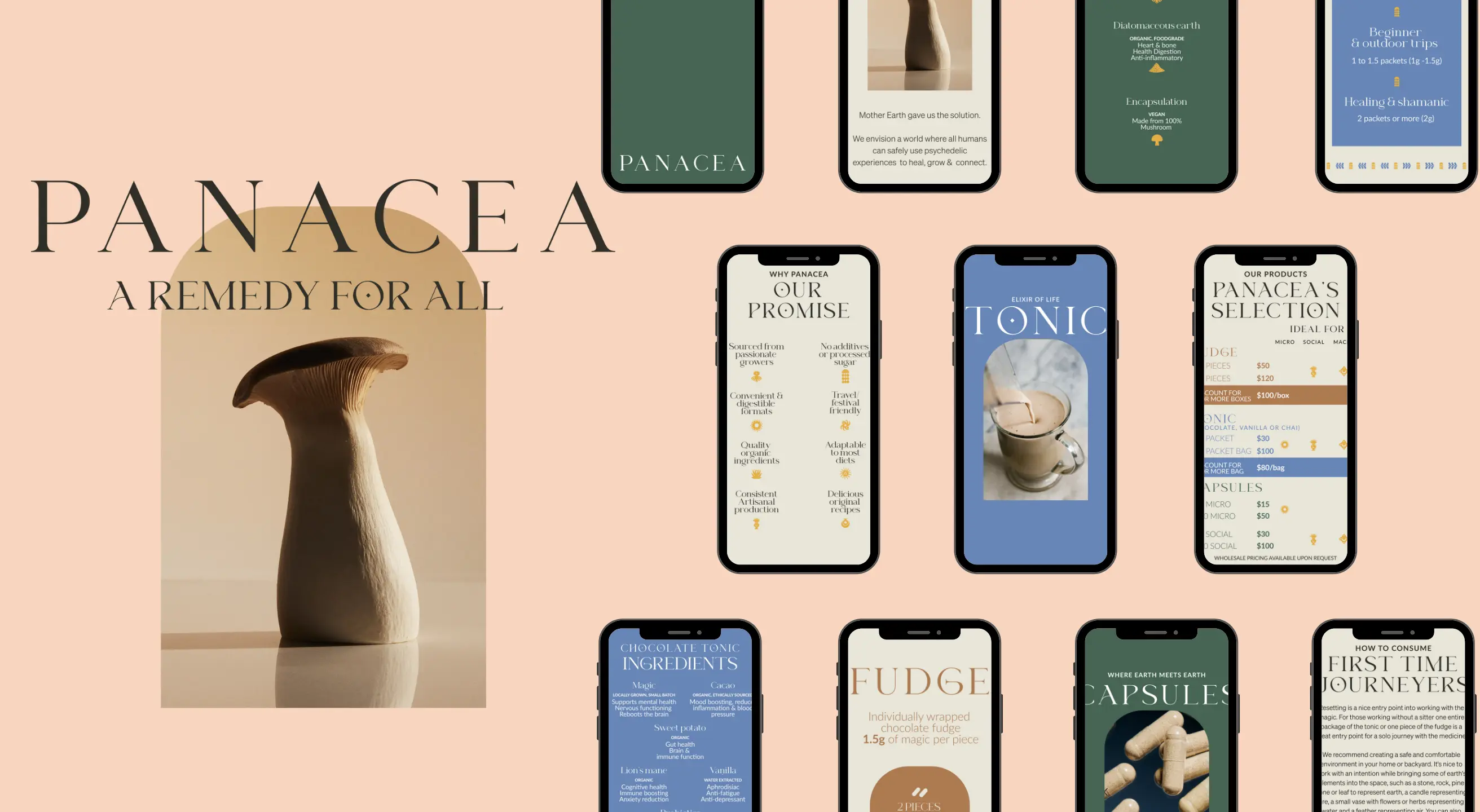
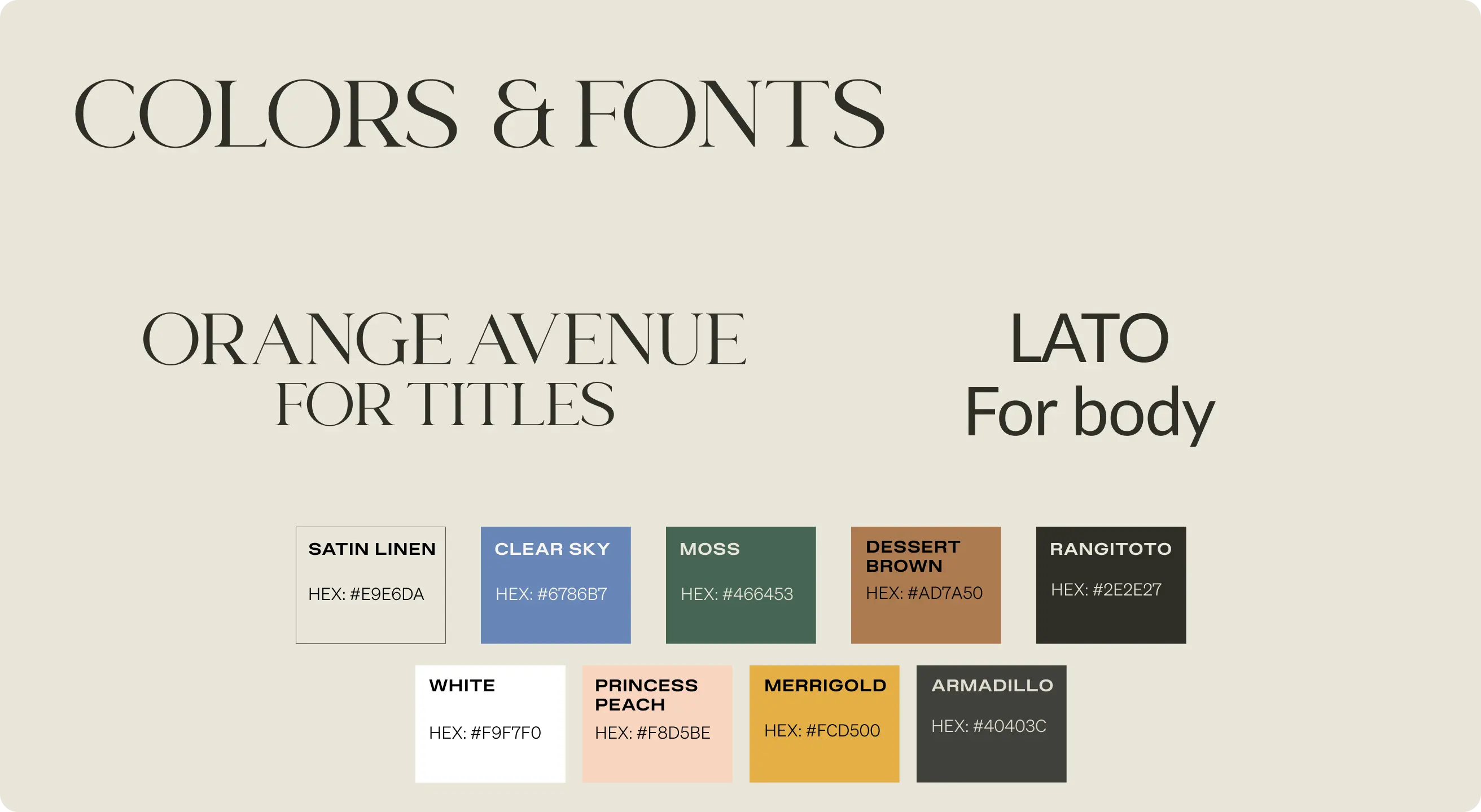
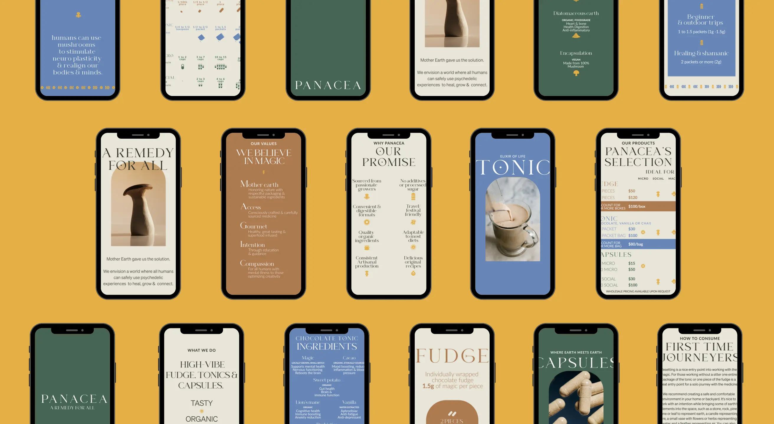
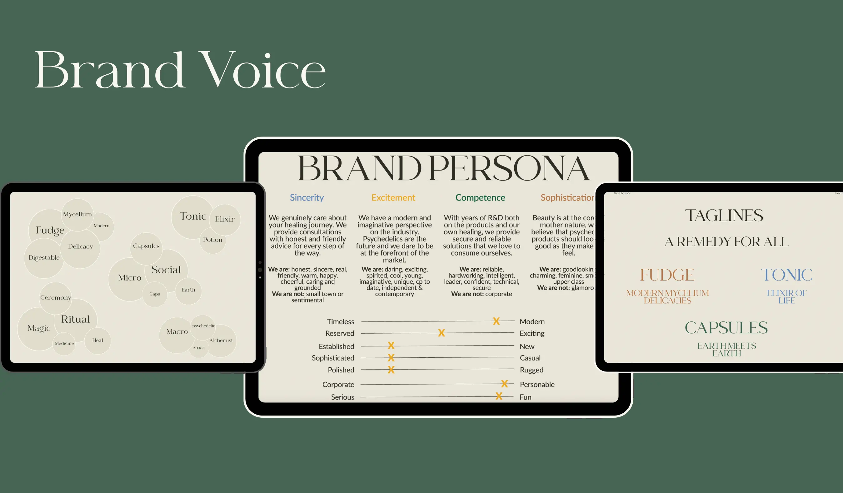
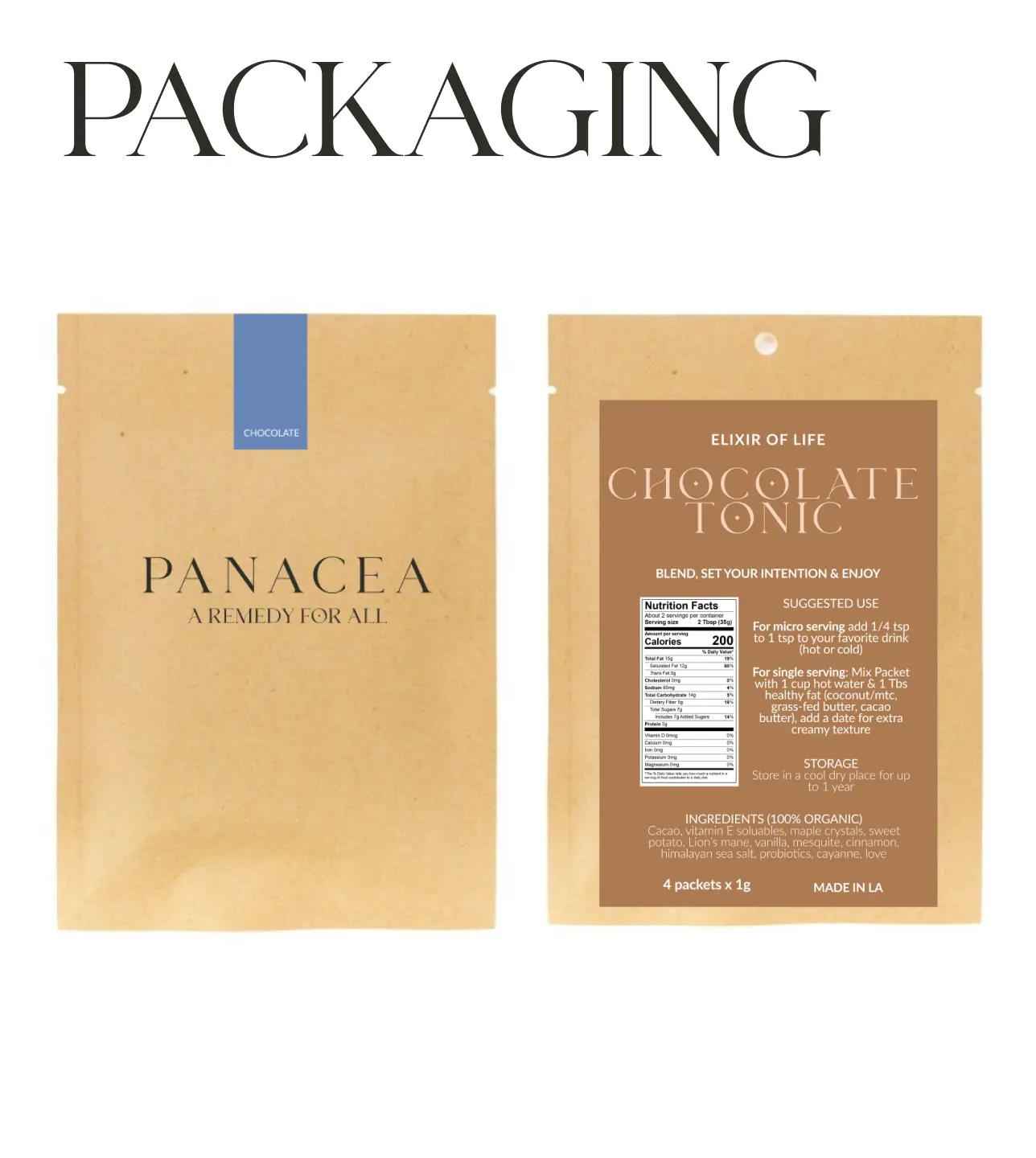
We leaned into natural elegance and sacred minimalism, pulling from wellness cues, plant medicine symbolism, and clean, elevated packaging aesthetics. The goal was to speak to both the spiritual and health-conscious buyer — creating something that felt inviting, modern, and ritual-worthy.
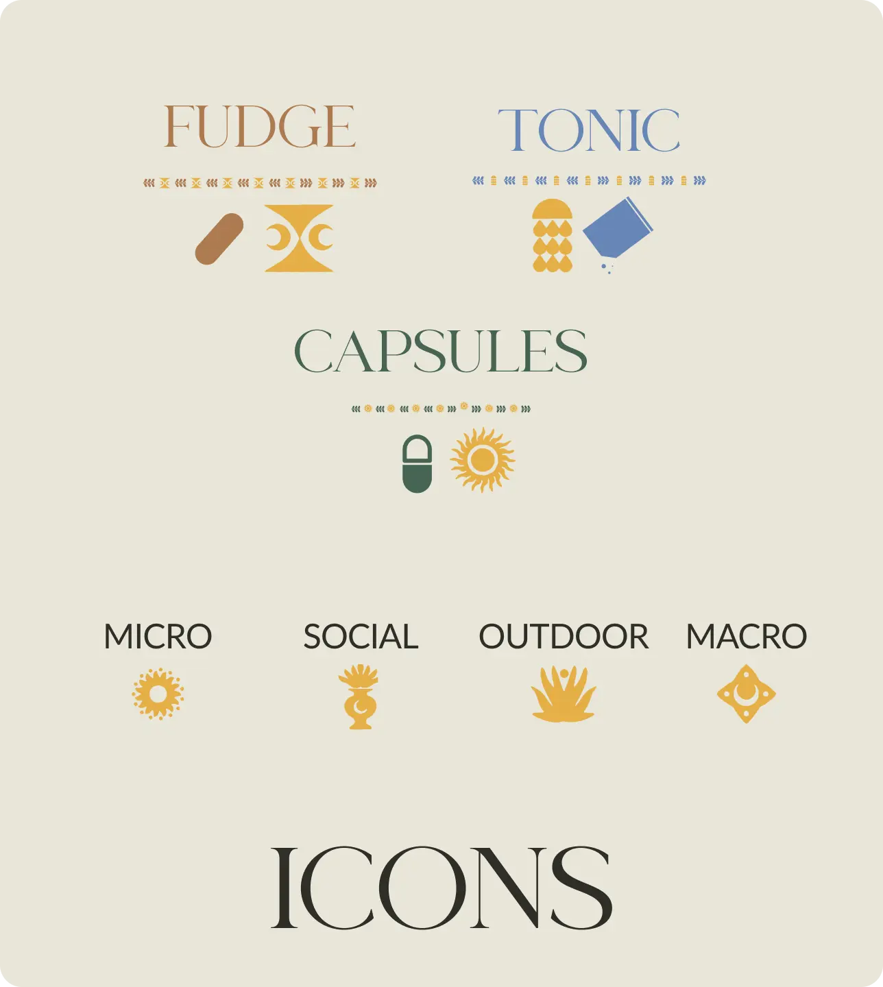
Each product was given its own visual identity — using color theory and form to express the essence and effect of each mushroom. The result is a brand that feels as good as it looks.
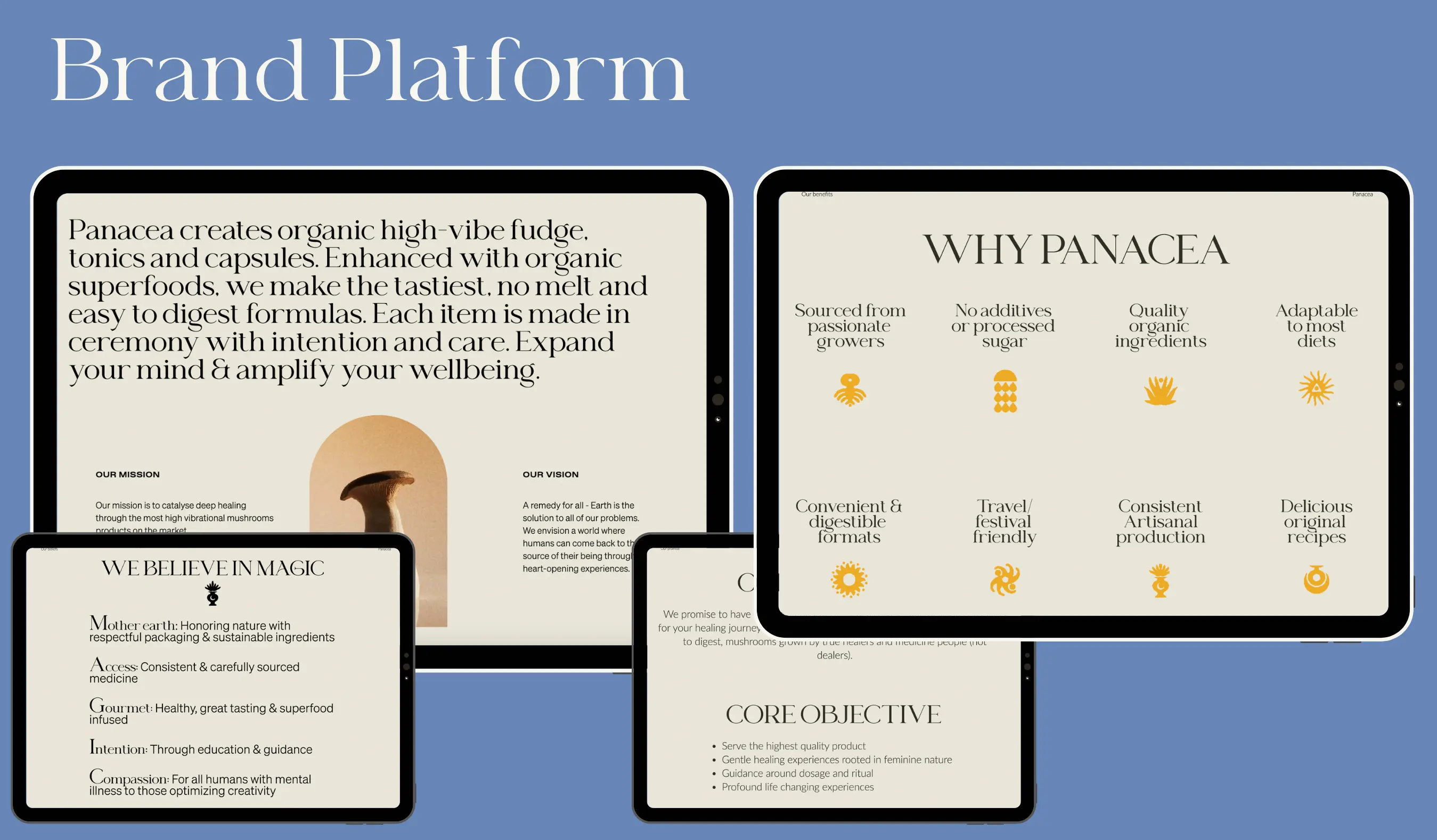
The new Panacea brand now radiates trust, beauty, and professionalism — aligned with its functional and spiritual promise. The rebrand laid the foundation for retail growth and a wider product offering. Panacea’s visual identity now honors the intelligence of mushrooms while speaking the language of the modern wellness consumer.

.svg)
.svg)
